It’s been a busy few weeks, hence the lack of blogs, and what I wouldn’t give for a holiday right about now. I think we can all relate to wanting a sense of escape. One of the things I’ve missed most over the past year is travelling, discovering new places and seeking out the sun.
I can imagine it’s exactly this kind of insight that was behind Ryanair’s ‘Vax and Go’ holiday campaign. The tourism sector has taken such a hit, that it’s kind of understandable that they would go for a shock tactic campaign - one they definitely knew would get talked about. People are desperate to get away and their young target market were well-represented in the ads. The fact that this younger cohort would literally be the last to be able to ‘vax and go’ anywhere, may or may not have escaped their attention. And, despite knowing (and having experienced) Ryanair’s reputation, I actually WAS shocked by the ads, and not at all surprised when got pulled for being ‘irresponsible, insensitive and offensive.’
That being said, I actually don’t need any kind of advertising right now to entice me away on holiday. But, while researching staycations - and the lack of trains to Donegal - I came across this great vintage poster for the The Donegal Railway Company. A bit of artistic licence has clearly been used, those skies are extremely blue for Ireland, but seeing this led me down a rabbit hole of travel posters and advertising.
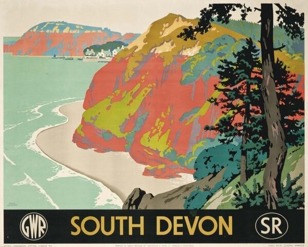
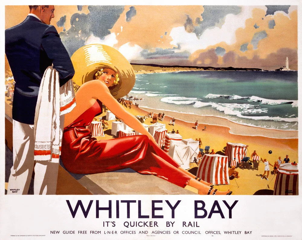
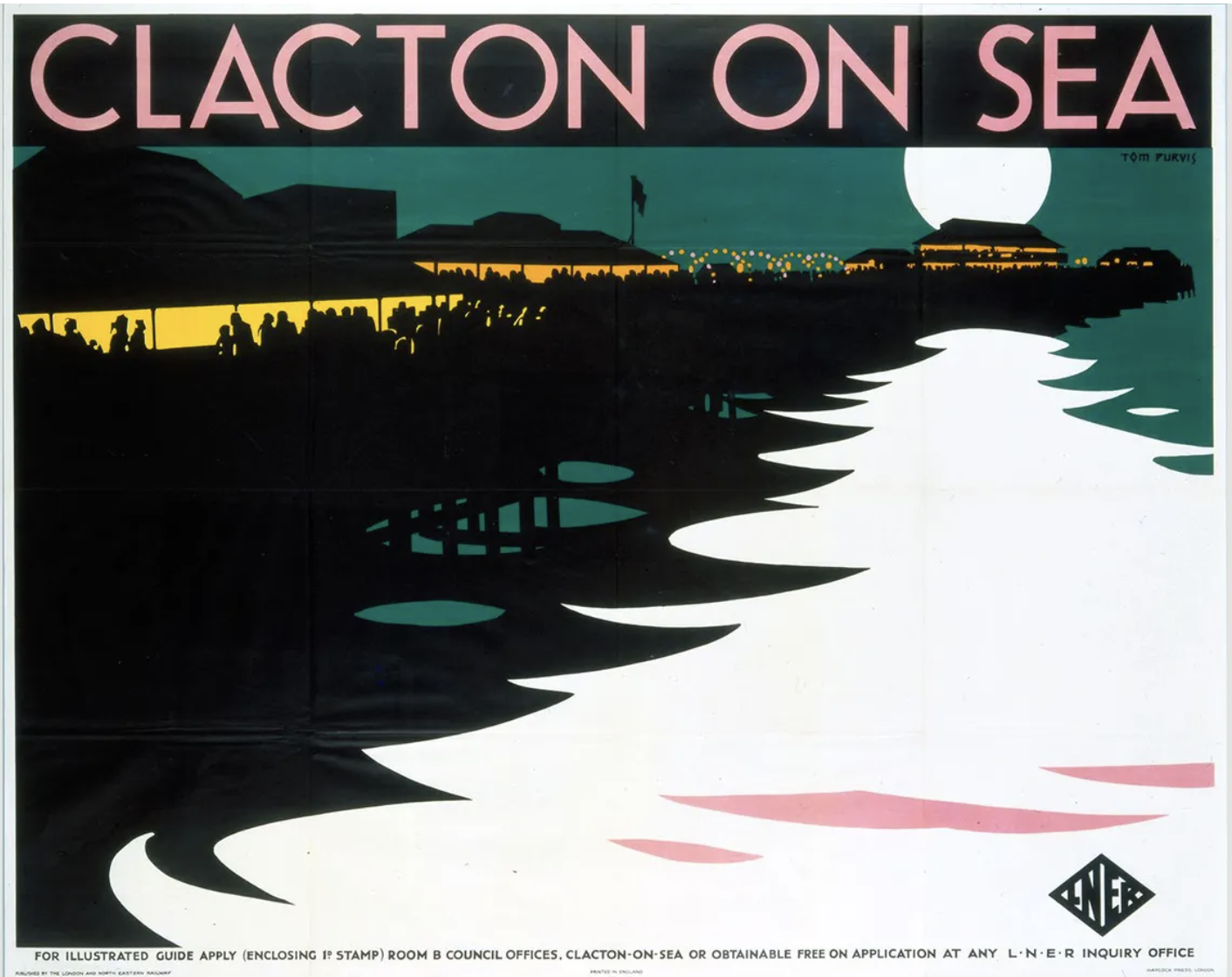
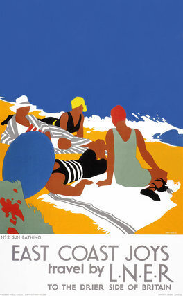
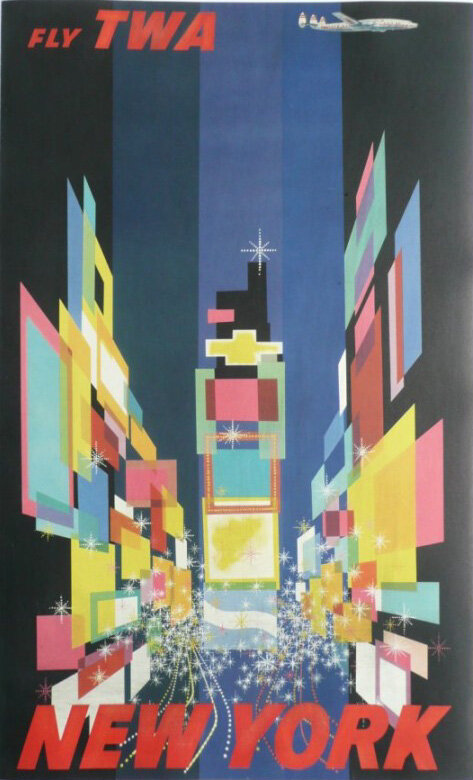
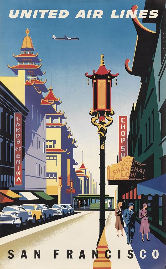
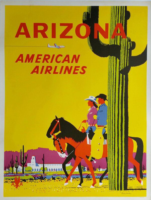
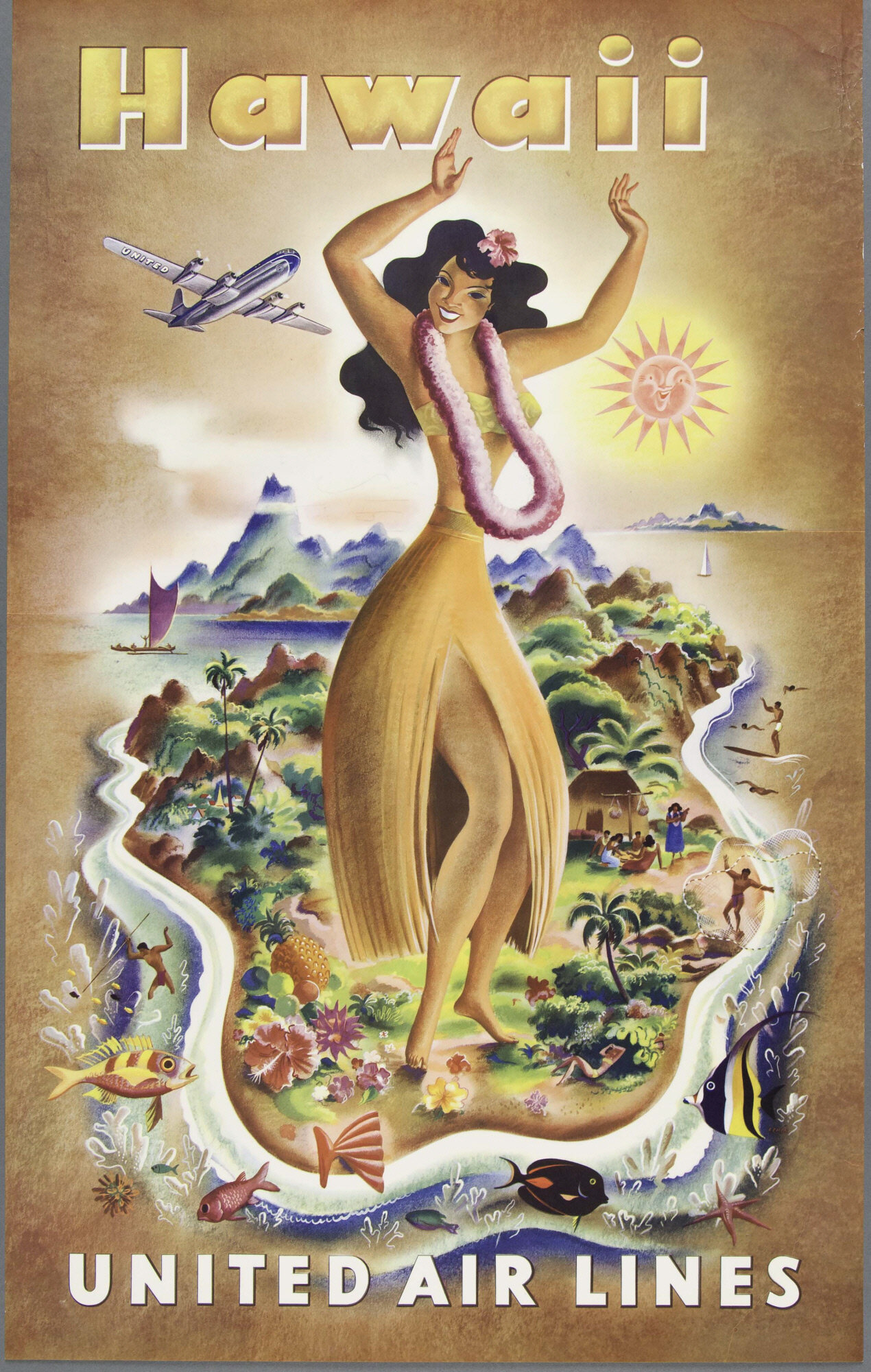
We take for granted now that posters – or OOH – are part and parcel of any advertising campaign, but around the end of the nineteenth and early twentieth century poster design went through a golden age and was viewed as a respected art form. Developments in printing technology allowed for mass production of colour images, and these posters were often commissioned by rail lines and later airlines to advertise their particular mode of transport and the exotic destinations you could travel to – even if that exotic location was Slieve League.
Poster artwork changed with the various artistic styles that were in fashion, from Art Nouveau to Art Deco to Modernism and that also influenced the messaging that appeared on them. In earlier posters, they would be cluttered with images of an area’s attractions and tried to cram in train times and prices. There would also be multiple typefaces and of course the company name as big as possible. (Some things never change though, do they?) The poster for Donegal rail and this one for the ill-fated White Star Line are pretty good examples.
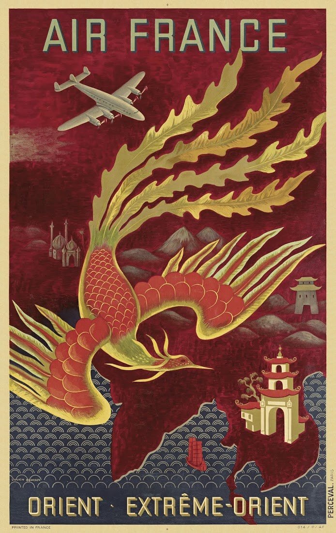
Later however, designers focused on delivering a clear message about a single destination. Influenced by Japanese art, they began using block colours and black outlines with a strong focus on shadow and light. They also incorporated modern clean typefaces and pared down their messaging. The London and North Eastern railway (LNER) embraced this aesthetic wholeheartedly and their posters still feel quite modern today. The hierarchy of information is clear and they have the headline, subline and call to action that we’d be familiar with on modern advertising. Air travel kicked things up a gear and the locations became more far flung and exotic, from coast to coast and Hawaii in the US, and from Europe to the Far East and Africa.
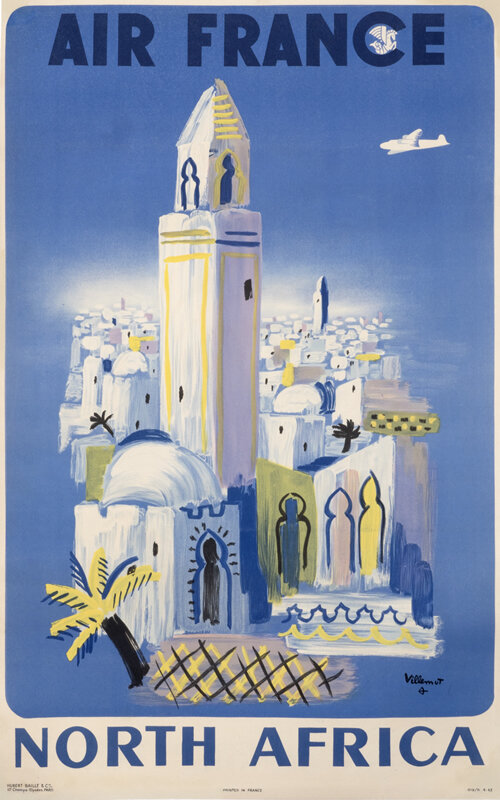
This Air France North Africa poster by Bernard Villemot is one of my favourites, primarily because it reminds me of a destination I was really hoping to get to this year – the Jardin Majorelle in Marrakech, Morocco. The garden was created over a period forty years by the French artist Jacques Majorelle and is painted a particular shade of cobalt blue that is named after him – Majorelle Blue- a sister shade to the more famous International Klein Blue (incidentally, what is it with French men and the colour blue?) It’s a completely idealised space, taking inspiration and botanical specimens not just from Morocco but from all over the world.
But then, many of the travel posters that these artists produced were also idealised versions of the places they represented, and in that spirit, I decided to make my own version of Jardin Majorelle, as well as an absolutely unnecessary advertisement for it. I’ve taken my cue from the LNER posters using their pared down approach, their brand typeface Gill Sans, as well as adding my own company logo, albeit at a more reasonable size. Now I really wish I was there.
A full render of the Jardin, plus some sexy evening shots


